
Having a logo that is not only unique, but one that easily recognizable is one of the most important things a business or brand can do. Sure, a logo won’t sell your product, but some of the most valuable brands in the world have great logos. Often times companies spend a fair amount of time and money on researching a logo that works the best for them. Every now and then they also like to throw in hidden messages into their logos. So which ones are the best? Let’s take a look at a list of 20 companies that have hidden meanings and messages within their logos.
Photo by Justin Sullivan/Getty Images

20. Pinterest
Pinterest is a popular image sharing and social media website where users “pin” images and internet clippings to their own personal board. Their logo is either seen as just their “P” or the entire websites name. Regardless if you take a closer look at the “P”, you realize that it looks just like pin.
Photo from Pinterest
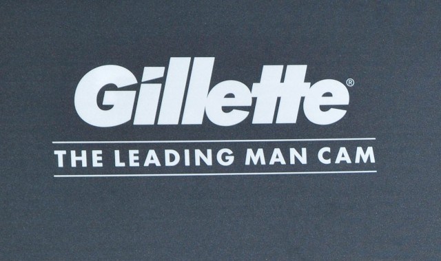
19. Gillette
Established in Boston in 1901, Gillette is one of the largest and most profitable brand of safety razors in the world. The produce a range of products, and their logo also has somewhat of a secret message. Since they are known for their precision blades, the wedges in the “G” and “I” are extremely fine-cut, which is meant to represent how sharp their blades are.
Photo by John Sciulli/Getty Images for Gillette
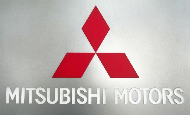
18. Mitsubishi
The Japanese Mitsubishi Motors is one company whose logo has a lot of hidden meanings. While the three-pointed design seems fairly simple, it’s actually far from the case. The origins of the logo can be traced back deep into Japanese history. Their logo is based on a combination of the three-leaf crest that was used by the Tosa Clan and the there-diamond crest that was used by the Iwasaki Clan. The diamonds are meant to represent “Integrity, reliability, and success”.
Photo by Koichi Kamoshida/Getty Images
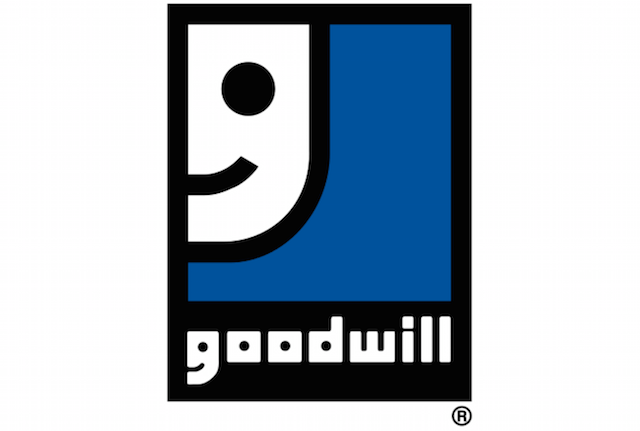
17. Goodwill Industries
Goodwill Industries is probably one of the most prominent non-profit organizations in the United States, and their logo also has a hidden meaning. You first notice the face in the upper left-side of the logo, but then when you actually read the word “goodwill”, you realize that the “G” is also styled as a face.
Photo from Goodwill Industries

16. Hershey’s Kisses
A common candy treat found in small bowls across the offices and living rooms of the world, Hershey’s Kisses are some of this chocolate companies most beloved snack. They’re known for not only their great flavor, but their unique shape as well. If you notice the negative space between the “K” and the “I” in the logo, you’ll see a Hershey’s Kiss turned on its side.
Photo from Hershey

15. Roxy
Launched in 1990, Roxy is a women’s active sports clothing brand that makes bikinis, pants, shirts, athletic wear, and a variety of other items. They are the sister company of Quicksilver, and their logo is very interesting. At first glance, the logo appears to be two hands that form together to make a heart. But once you take a second look, you realize that it’s actually two Quicksilver logos that have been rotated on their sides.
Photo from Roxy
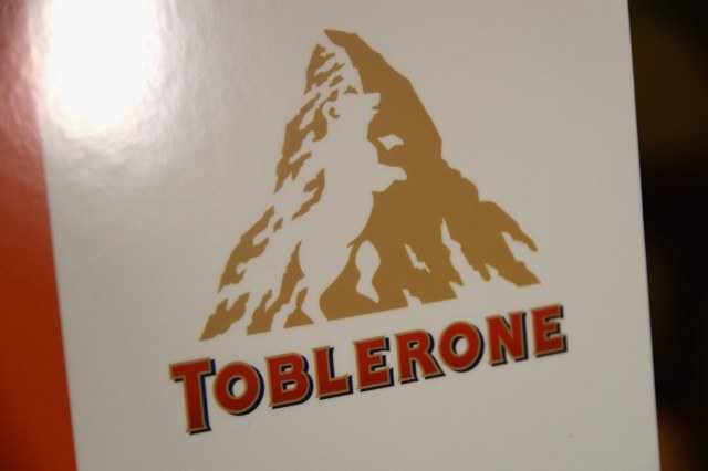
14. Toblerone
It seems like candy brands really enjoy adding hidden messages and images in their logo, because that’s the case with Toblerone. The chocolate brand can trace its roots to Switzerland and at first glance, their logo makes sense. But if you look closely you will notice a bear located within the shading of the mountain.
Photo by Ben Gabbe/Getty Images for NYCWFF

13. Toyota
The massive Japanese automobile brand that is Toyota is another company that has a hidden message in their logo. Their logo is fairly simple, however it is actually supposed to represent three different hearts: the heart of progress, the heart of the product, and the heart of the customer…which are all interlocking.
Photo by Justin Sullivan/Getty Images

12. The Tour de France
Yet another organization that has a clever logo is The Tour de France. The logo is pretty cool and is fairly artistic but it also has a secret: if you were to imagine that the sun is actually a bicycle wheel, you will then notice that the words are shaped like a person riding a bicycle.
Photo from Tour de France
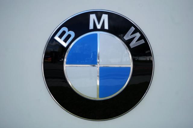
11. BMW
Known for their luxury motor vehicles, BMW is one of the worlds leading car brands. However they are a fairly old company, and have produced other products in the past outside of cars, including airplanes. The logo is actually supposed to represent a planes propeller in motion, with the blue sections representing the sky.
Photo by Johannes Simon/Getty Images

10. LG
LG is a brand that has one of the more obvious “hidden” messages within their logo. Their slogan has been “Life’s Good” for the longest time, so they created a logo to coincide with that message. Not only is their logo the two letters “L” and “G” but they also make a face that’s smiling.
Photo by David Becker/Getty Images
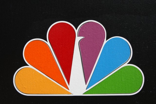
9. NBC
Like LG, NBC’s logo has a hidden design that’s fairly obvious once you look for it, as many probably already know. The logo that is most similar to the modern one was introduced in 1956, and was meant to represent all the colors that they broadcasted in, as they were one of the first networks to broadcast in color. But if you look at the white spot closely, it suddenly becomes a peacock.
Photo by David McNew/Getty Images

8. Pepsi
The Pepsi logo has remained fairly consistent over the years, but apparently the most recent logo has a lot of depth to it. Pepsi reportedly gave $1 million to Arnell Associates to come up with the current logo, and it is supposed to represent some odd combination of feng shui, the dynamo theory of the Earth, the theory of relativity, and some strange relationship to the Da Vinci Code. It seems like sort of a stretch to me, but that’s what it is meant to represent.
Photo by Joe Raedle/Getty Images
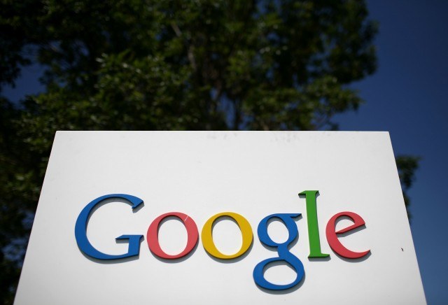
7. Google
Google has always had a very straightforward logo, as it is just their name printed in different colors. But the hidden message lies within the specific colors. All of the letters besides the “L” are in primary colors, but the “L” is a secondary color that is meant to show that they will always shake things up and that they don’t always listen to the rules.
Photo by Justin Sullivan/Getty Images

6. Baskin Robbins
Popular ice-cream and dessert company Baskin Robbins has a pretty clever logo as well. It’s simply their initials and their name, but like Google’s logo, it’s the colors that hold the true meaning. If you look at the pink part, it reads “31” which are the number of ice cream flavors that they offer.
Photo from Baskin Robbins

5. Tostitos
Tostitos, a brand owned by Frito Lay, produces a range of tortilla chips and dips that are idea for social gatherings and snacks. Since enjoying salsa is often an activity shared with others, Tostitos wanted to incorporate that idea in their logo. That is why the middle “T”s in the logo appear to be two people holding a chip, and the “I” looks like a bowl of dip.
Photo from Tostitos

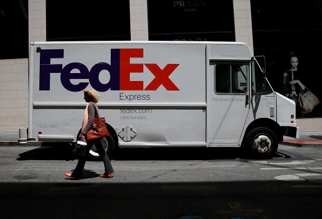
4. FedEx
FedEx is another company whose “hidden message” in their logo is quite ingenious. If you examine the negative space that exists between the “E” and the “X”, you realized that it forms the shape of an arrow. Obviously this is very fitting given the fact that they are a shipping company.
Photo by Scott Olson/Getty Images
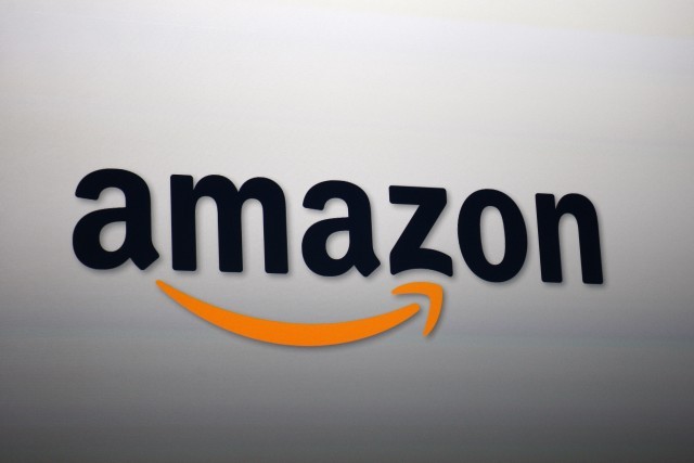
3. Amazon
You can purchase almost anything off of Amazon, and they know that, which is why their logo is designed the way it is. Underneath the companies name, they put a orange arrow that starts at “a” and goes to “z”, signifying that they sell everything from a to z.
Photo by David McNew/Getty Images

2. Cisco
Cisco Systems is an American technology company that has one of the more interesting logos, at least in my opinion. It seems like their logo is extremely simple, but that couldn’t be further from the truth. They originally established themselves in San Francisco, which is where they get their name from. Additionally the bars above their name are meant to represent the Golden Gate Bridge.
Photo by Justin Sullivan/Getty Images
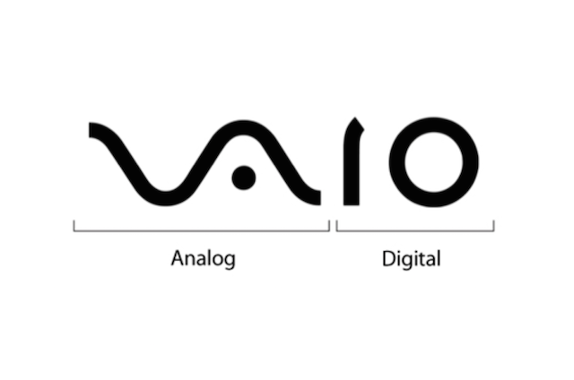
1. Vaio
Sony’s Vaio logo is another extremely interesting and unique logo that has a hidden message, as this image shows you. The letters in the logo represent a traditional analog signal that is then converted into the binary numbers “1” and “0” which are meant to represent the digital signal. It’s one of the most ingenious logos out there especially since they are a computer brand, at least in my opinion.
Photo from typepaintbook.tumblr.com