
Logo redesigns are often seen as a chance for companies to freshen up their image, but when the gamble doesn’t pay off, the results can be disastrous. Discover how major brands learned the hard way that changing a logo isn’t always a recipe for success.
Gap (2010)
Gap’s 2010 logo redesign was an immediate disaster. Introduced with minimal fanfare, it was a stark departure from the brand’s classic design. The new logo sparked a backlash; consumers claimed it looked too generic and uninspired. Gap reversed the change within a week, returning to the original design. Talk about a 180!
Tropicana (2009)
In 2009, Tropicana went with a packaging redesign to modernize the brand, but it ended in disaster. Consumers found the new look confusing, especially the lack of a recognizable “orange with a straw” image. The result? A 20% drop in sales—about $30 million—within just two months forced the company to revert to its old design.
Uber (2016)
Another company rebrand that went wrong was Uber’s 2016 logo refresh. The new design failed to resonate with users and didn’t communicate the brand’s evolution as intended. The clean, geometric design was supposed to symbolize a modern, forward-thinking company. Instead, it was met with confusion and frustration from users. Uber listened and quickly made revisions.
Pepsi (2008)
Pepsi underwent a logo redesign in 2008 as part of a new marketing ploy. Did it impress? Nope, not at all because the logo’s supposed quirky smile or the letter P were meant to appeal to younger audiences, but instead, it caused confusion and alienated loyal customers. It’s clearly not easy to overhaul an iconic logo!
J.C. Penney (2011)
J.C. Penney’s 2011 logo redesign aimed to modernize the brand but backfired with its traditional customers. The fresh look, part of a broader strategy, failed to resonate, leading to criticism and declining sales. The retailer soon reverted to a conventional design to reconnect with its core audience and recover losses.
Kraft (2009)
The updated look of the Kraft 2009 logo was considered too generic and far removed from Kraft’s familiar, iconic logo. Despite efforts to modernize, the logo failed to communicate Kraft’s legacy. By 2012, the company abandoned the redesign in favor of something more recognizable. The lesson: keep your customers in mind when rebranding.
Animal Planet (2008)
In this case, Animal Planet went entirely off-script—removing the beloved elephant on their 2008 rebrand for a more mature approach. Viewers were left confused and wondered why that move was necessary. This logo remained until October 2018, when the channel brought back the elephant in a simplified, animated blue elephant.
Olympic Logo (2012)
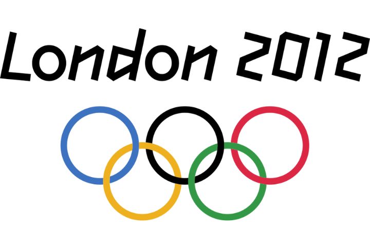
You immediately see the five intertwined rings whenever you hear the word Olympics, right? Well, the 2012 London Olympics logo, which debuted in 2007, sparked outrage due to its complex, bright, fragmented, abstract design. The bold logo, meant to represent a forward-thinking, youthful London, was met with mixed reactions. Many felt it was too busy and a joke.
MySpace (2010)
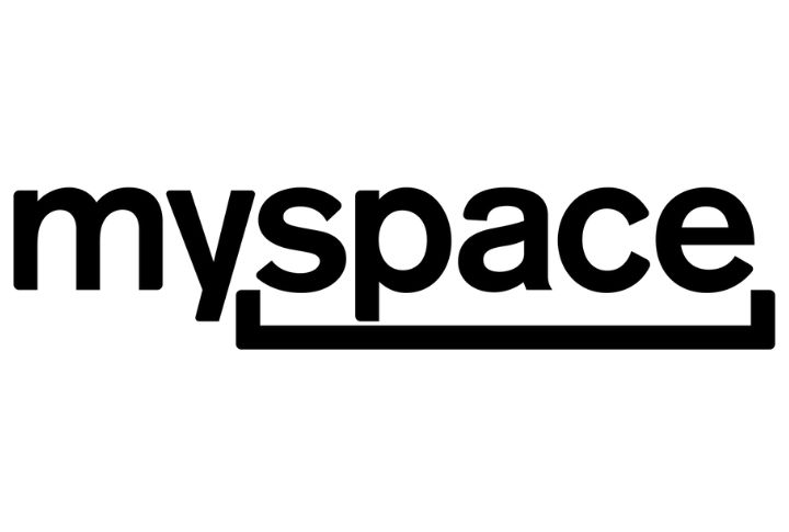
When MySpace decided it wanted a new look in 2010, it changed its logo with the goal of reviving the once-dominant social media platform. Unfortunately, this hit was a miss since the new logo confused users who were already seeing the platform’s decline. The change didn’t bring the desired “cool” factor, and MySpace continued its slide into obscurity.
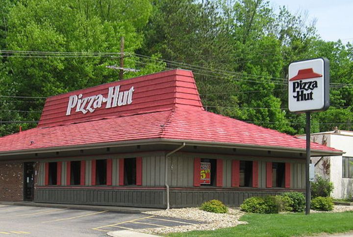
Pizza Hut (2014)
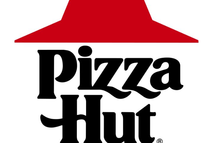
Just before 2015, Pizza Hut thought giving the logo a fresh look as part of a new marketing strategy was brilliant. It had a red circle and a hat inside, something never done before. Sadly, that marketing strategy didn’t pan out as planned. There was a dip in sales, such that by 2019, they had reverted to their 1974-1999 version to combat competition from newer brands.