Aston Martin is one of the most famous car companies in the world, and they have been for some time. Aston Martin produces luxury, high-end grand tourers and sports cars that have been pretty popular, and are famously used in nearly all of the James Bond films. Over their rich history, the company produced many famous cars with their “DB” series being arguably the most famous. Aston Martin has also seen its logo change a few times over the years. Aston Martin was first formed by Robert Bamford and Lionel Matin in 1913 under the name “Bamford & Martin Ltd”. It wasn’t until 1914 when the company changed their name to Aston Martin. We are going to take a look at the evolution of the Aston Martin logo over the years.

The early Aston Martins featured a very different logo than the one that is often associated with a brand. Despite forming the company in 1913, it wasn’t until 1921 that we see a logo being implemented. The first Aston Martin logo was pretty straightforward and featured the letter “A” and “M”. This logo was used by the company from 1921 until 1926. The company actually closed its doors down in 1925, however a group of investors brought it back to life as “Aston Martin Motors Ltd” a year later.

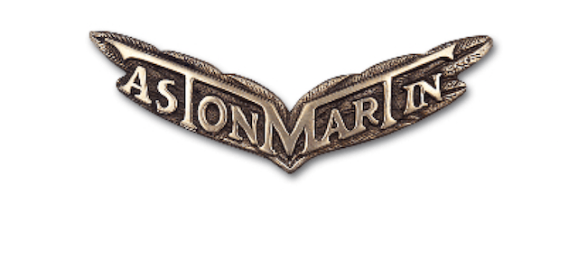
In 1927 we see the birth of the Aston Martin wings, as the new company scraped their old logo to make way for the more elegant and sophisticated one.

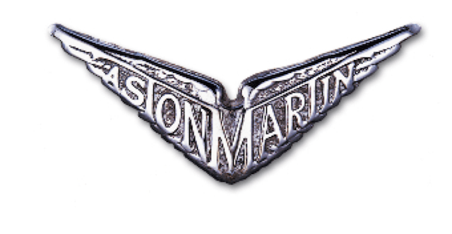
Just three years later we see Aston Martin changing their logo again, getting rid of the bronze look for a more stainless-steel appearance, while changing the lettering of the words slightly.

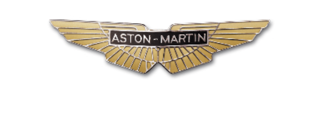
In 1932 we see the introduction a yet another Aston Martin logo. This time around the company would more or less stick to this version of their logo, only adding or changing slight details over the years. The only major difference to this logo was seen in 1950.

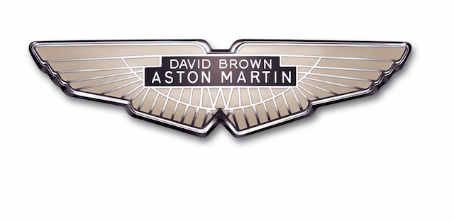
At the end of World War II Aston Martin was crippled and struggling financially. The company was purchased by a tractor manufacturing company known as David Brown Limited lead by Sir David Brown. During these years of ownership Aston Martin saw some of its most successful and famous vehicles produced. The various “DB” vehicles are often regarded as Aston’s best work, and their most valuable vehicles are cars from that era. “David Brown” would be featured on the logo until 1971.

After the relationship with David Brown ended with Aston Martin in 1972, the company returned to a more elegant rendition of their logo and we see David Brown’s name missing. From here on out the logo remained pretty consistent.

The current Aston Martin logo came out in 2o03 and as you can see it is pretty similar to the older ones. a few subtle details were changed, but Aston still sticks with their famous wings. Aston Martin’s logo has had an interesting history, and today that logo stands for a car manufacturer that only offers the best.
Photo by Christopher Furlong/Getty Images and Aston Martin
